
The Process


Final Business Card
The business card is reflective of the crystal card while incorporating the secondary and primary logo maintaining the clean white design with the powerful punch of color on the back to grab people’s attention.
Final Crystal Cards


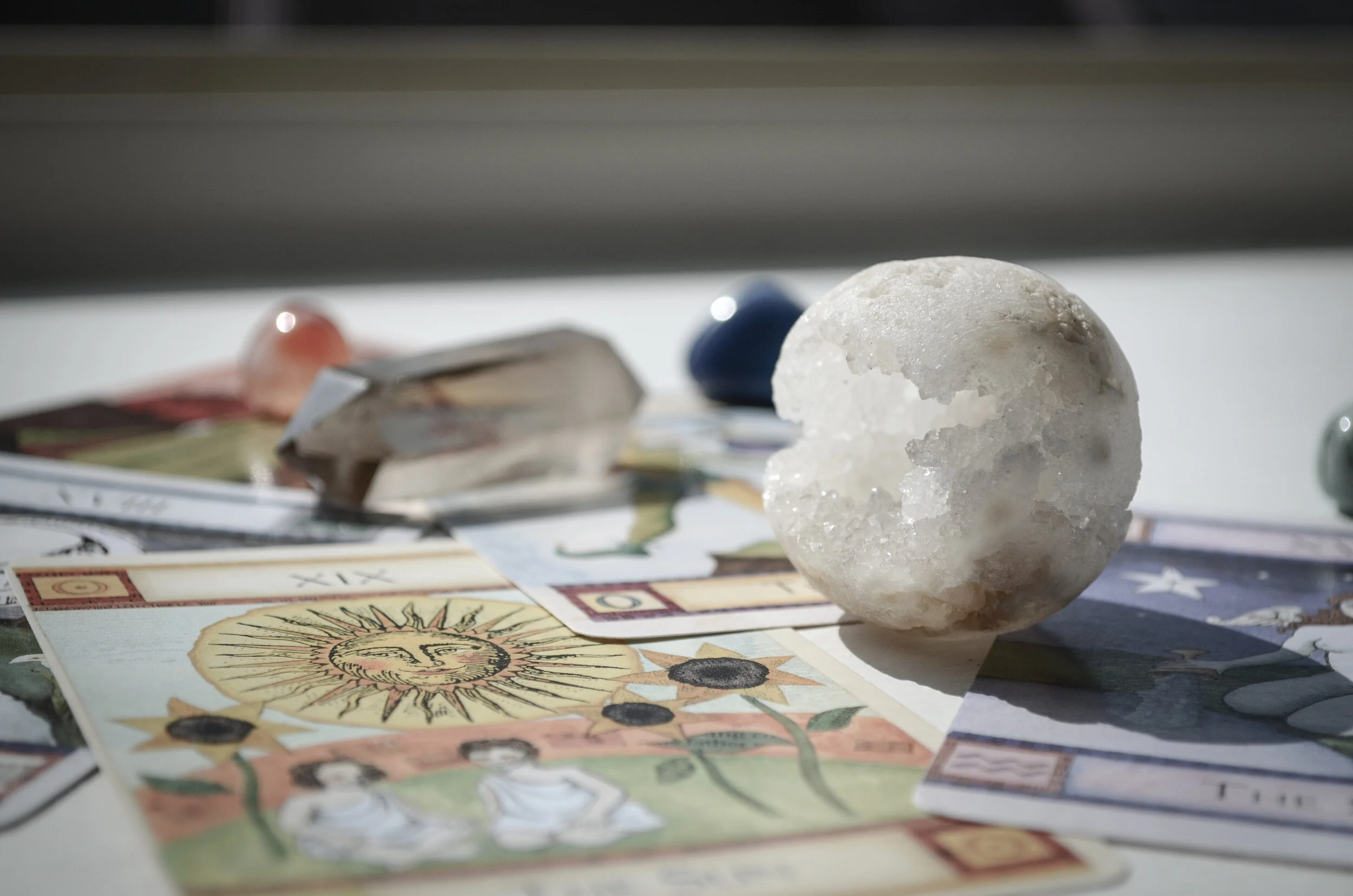
To explain the purpose of these cards, if you were to go into The Apothecary and purchase a crystal, you would get this card with it. The final crystal card includes the front (left side), the inside after you open the card, and the back (right side). The front has the name of the crystal, an affirmation of the crystal as well as whichever chakras the crystal aligns with, whether it be 1 or all 7 chakras there’s space for it all. When you open the card you see the primary chakra color of the stone screened back. You find a description of the stone’s energy as well as the symbols for the chakras that the stone aligns with and the zodiac signs. The back acts as a secondary business card as to where you can find more crystals or how to get in contact with The Apothecary.

Brochure
Poster
The poster acts in an informational way yet also being aesthetically pleasing enough to want to hang and create your own meditation or holistic healing practice space. Within the poster, you find information on each Chakra their foundation, name, placement, associations, and more.


Final Website
Feel free to explore the final design of the website yourself by clicking the button below!